Australian Temperatures
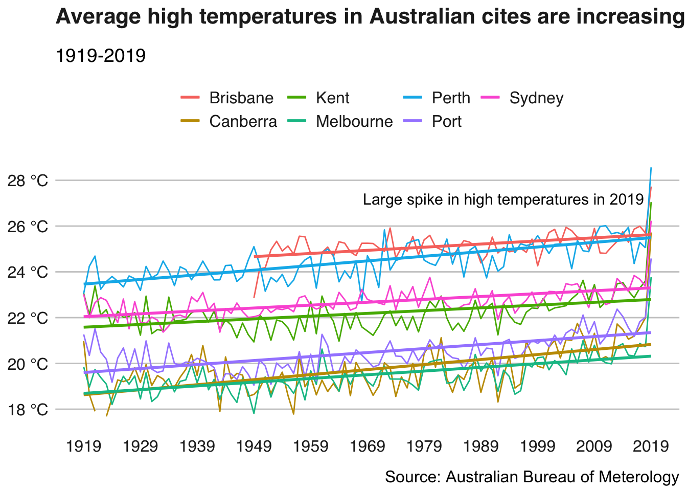
In an effort to get into a groove of posting and participating in weekly TidyTuesday data visualizations, here’s a quick look at how the average daily high temperatures have changed in Australia. Temperatures have clearly been increasing over the last 100 years, with an especially dramatic increase in 2019, likely contributing to the recent forest fires.
require(tidyverse)
temp <- readr::read_csv('https://raw.githubusercontent.com/rfordatascience/tidytuesday/master/data/2020/2020-01-07/temperature.csv')

temp <- mutate(temp, year_month = format(date, "%Y-%m"),
               year = as.numeric(format(date, "%Y"))) %>%
  mutate(city_name = str_to_title(city_name)) %>%
  filter(temp_type == "max") %>%
  filter(year >= 1919) %>%
  group_by(year, city_name) %>%
  summarize(temperature = mean(temperature, na.rm = T))
temp %>%
ggplot(aes(x = year, y = temperature, group = city_name, color = city_name)) +
geom_line() +
geom_smooth(method = "lm", se = F, size = 1) +
scale_x_continuous(name = "Year", breaks = seq(1919, 2019, 10)) +
scale_y_continuous(name = "High Temperature (Celsius)", labels = paste0(seq(14, 30, 2), " °C"), breaks = seq(14, 30, 2)) +
scale_color_discrete(name = "City") +
labs(title = "Average high temperatures in Australian cites are increasing",
subtitle = "1919-2019",
caption = "Source: Australian Bureau of Meterology") +
annotate("text", label = "Large spike in high temperatures in 2019", x = 1993, y = 27.2, size = 4) +
bbplot::bbc_style() +
theme(plot.title = element_text(size = 16),
plot.subtitle = element_text(size = 14),
plot.caption = element_text(size = 12, hjust = 1),
axis.text = element_text(size = 12),
legend.text = element_text(size = 12))